
Web Design Blog
Common Homepage Design Mistakes That Are Quietly Killing Your Credibility
Imagine you’ve just finished a brilliant discovery call with a potential client who’s ready to invest £10,000 in your services. You send over your URL, and suddenly, that familiar pit of dread forms in your stomach. You’re hovering over the “send” button, praying they don’t notice the clunky layout or the confusing text that hasn’t been updated in ages. It’s a frustrating paradox; you’re a leader in your field, yet your website feels like a budget template that’s seen better days.
If you’re tired of seeing high bounce rates and feeling a bit embarrassed by your digital presence, you aren’t alone. We agree that your website should look as professional as the actual service you provide. In this article, we’ll uncover the common homepage design mistakes that are quietly killing your credibility and driving away your best prospects. You’ll learn how to transform your homepage into a professional, high-converting digital handshake that filters out the tyre-kickers. We’re skipping the corporate fluff and technical jargon to give you actionable steps that make your business look like the high-end firm it truly is.
Key Takeaways
- Master the “3-second rule” by ditching flowery jargon for a clear value proposition that instantly connects with your ideal client.
- Uncover why sluggish load speeds and poor mobile optimisation are the invisible killers of your site’s conversion rates.
- Learn to avoid common homepage design mistakes such as “clever” navigation labels that confuse visitors instead of helping them find your services.
- Discover how a strategically placed, action-oriented Call to Action can transform your homepage from a static brochure into a lead-generating machine.
- Find out why moving beyond generic templates is essential for professional firms looking to project genuine authority and credibility.
The ‘What Do You Actually Do?’ Problem: Vague Value Propositions
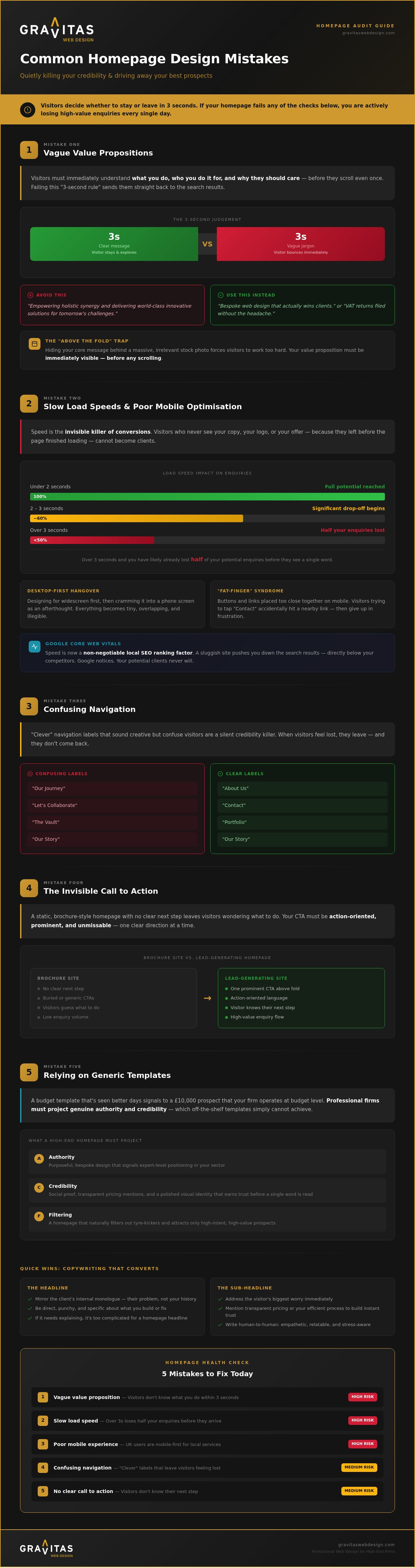
Close your eyes and count to three. One, two, three. In that tiny window of time, a visitor to your site has already decided if you’re the expert they need or just another tab to be closed. This is the “3-second rule,” and it’s the harshest judge in the digital world. If someone lands on your page and can’t immediately tell what you do, who you do it for, and why they should care, they’re gone. It’s a brutal reality; your visitors are looking for a reason to leave, not a reason to stay.
One of the most common homepage design mistakes we see is the “corporate word salad.” You know the type. It’s full of phrases like “empowering holistic synergy” or “delivering world-class innovative solutions.” To a busy business owner in London or Birmingham, that means absolutely nothing. It’s the digital equivalent of a cold cup of tea; uninviting and ultimately disappointing. Using plain, direct British English isn’t just simpler, it’s more profitable. If you use flowery jargon to sound “professional,” you’re actually just creating a barrier between you and your next client.
Then there’s the “Above the Fold” trap. This is that top section of your site visible before a user starts scrolling. Often, businesses hide their core message behind a massive, irrelevant stock photo of people laughing at a laptop or shaking hands in a sunlit office. If your message is buried under a giant image that doesn’t add value, you’re making your customers work too hard. Professional copywriting is your secret weapon here. It ensures your value is served on a silver platter rather than hidden in a digital scavenger hunt. Clear words win every time.
Crafting a Headline That Actually Sells
Your headline isn’t the place for a history lesson. Your customers don’t actually care about the exact date you started the company, at least not yet. They care about their own problems. Instead of “We are a leading UK consultancy,” try something that mirrors their internal monologue. “Get your VAT returns filed without the headache” or “Bespoke web design that actually wins clients.” Be direct. Be punchy. Tell them exactly what you build or fix. If you can’t explain it to a five-year-old, it’s probably too complicated for your homepage.
The Role of Sub-headlines in Building Trust
If the headline is the hook, the sub-headline is the reel. This is where you expand on the “how” without drowning them in technical jargon. Address their biggest worry straight away. Are they worried about hidden costs? Mention your transparent pricing. Are they pressed for time? Highlight your efficient process. Keep it relatable and empathetic. You’re a human talking to another human who is likely stressed, busy, and looking for a partner they can actually trust. Show them you understand their journey.
Mobile Missteps and Sluggish Load Speeds
Have you ever tried to open a website whilst waiting for a train at New Street, only to give up because the spinning wheel of doom lasted longer than your patience? We’ve all been there. Speed is the invisible killer of conversions. If your site takes more than two seconds to load, you’ve likely already lost half of your potential enquiries. They haven’t even seen your brilliant copy or your sleek logo; they’ve simply bounced back to the search results to find someone faster.
One of the most frustrating common homepage design mistakes is the “desktop-first” hangover. It’s when a designer builds a beautiful widescreen masterpiece and then tries to cram it into a smartphone screen as an afterthought. Everything becomes tiny, overlapping, and impossible to read. In a world where UK users are increasingly mobile-first for local services, this isn’t just a minor glitch; it’s a direct hit to your bottom line.
Google’s Core Web Vitals have made speed a non-negotiable part of local SEO. If your site is sluggish, Google will notice, and your ranking will suffer. It’s that simple. You can’t afford to let a slow server or unoptimised code push you down the search results where no one will ever find you.
Why Your Mobile Site Feels Like a Chore
Neglecting the mobile user experience is one of the most expensive common homepage design mistakes you can make. Smaller screens need more breathing room. On mobile, the “clutter” that looks fine on a large monitor, such as complex sidebars or decorative flourishes, needs to disappear. Your phone number and contact buttons must be “thumb-friendly” to avoid the frustration of “fat-finger” syndrome. This happens when a user tries to click “Contact” but accidentally hits a tiny link nearby because they’re too close together. Mobile speed is a critical ranking factor that determines how high you appear in local search results.
The Impact of Image Optimisation
Those massive, high-resolution “hero” images might look stunning in a design studio, but they’re secretly bloating your load times. There is a world of difference between a site that looks good on office Wi-Fi and one that loads fast on a spotty 4G connection in a London cafe. This is why performance-led builds, like our bespoke web design in Birmingham, prioritise code efficiency from the ground up. If you’re worried your current site is more of a digital anchor than a lead-magnet, you might want to audit your site performance today.
Confusing Navigation: Why Your Visitors Feel Lost
Imagine walking into a high-end office in London where the receptionist speaks only in riddles. You ask for the boardroom, and they point to a door labelled “The Inner Sanctum of Dreams.” You’d probably turn around and walk right back out. This is exactly what happens when you choose “clever” navigation over clear communication. It is a classic example of common homepage design mistakes that prioritises ego over the user experience. If people have to think too hard about how to find your services, they’ll simply find someone else who makes it easier.
Then there is the “Paradox of Choice.” When you give a visitor fifteen different links in your main menu, you aren’t being helpful; you’re being overwhelming. Research often suggests that too many options lead to “decision paralysis,” where the visitor chooses to do nothing at all. Your navigation should follow the “Z-Pattern” of reading. Most western users scan a page starting from the top left (your logo), moving to the top right (your primary action), and then zig-zagging down the page. If your design fights this natural eye movement, you’re making it harder for people to hire you.
Don’t ignore the footer either. Whilst the top of the page is for quick decisions, the bottom is for the “deep divers” who want to verify your credibility. A missing or messy footer is a missed opportunity to show your physical address, social proof, or a quick site map. It’s the safety net of your website, catching those who’ve scrolled to the end and are looking for a reason to trust you.
Organising Your Services for Clarity
Your services should be grouped logically to reduce cognitive load. If you provide multiple professional services, don’t list them all individually in the top bar. Use familiar terminology that your Sutton Coldfield or London clients actually type into Google. For instance, use “Web Design” rather than “Digital Canvas Creation.” Also, always keep a visible “Home” link. Whilst we all know the logo usually takes you back, some users still look for that explicit word to feel grounded and in control of their journey.
The Importance of a Search-Friendly Structure
Navigation isn’t just for humans; it is the map Google uses to index your site. A clear hierarchy helps your local SEO for multiple locations by showing how different regional pages connect to your main service. Avoid “dead-end” pages at all costs. Every page on your site should lead the visitor to a logical next step, whether that’s another service page or your contact form. If you leave them at a dead-end, they’ll simply hit the back button and find a competitor who makes the journey feel effortless.
The Invisible Call to Action: Stop Making Customers Guess
Imagine walking into a high-end showroom in the heart of London. The lighting is perfect, the products are stunning, but there isn’t a single person to talk to and the till is hidden in a cupboard under the stairs. You’d leave, wouldn’t you? This is exactly what happens when your website lacks a clear Call to Action (CTA). It’s one of those common homepage design mistakes that feels like a polite British apology for actually wanting to do business. You aren’t being “pushy” by telling people how to hire you; you’re being helpful.
The top right corner of your homepage is the most valuable piece of digital real estate you own. It is where the human eye naturally lands when looking for the “next step.” If that space is empty or filled with a tiny social media icon, you’re practically inviting your visitors to go elsewhere. Similarly, relying on the “Weak CTA” trap is a recipe for low conversions. Words like “Submit” or “Click Here” are cold and technical. They don’t promise a result; they just promise a chore. Your buttons should be the bright, welcoming door that leads to a solution.
You also need a CTA after every major section of your homepage. People don’t all decide to buy at the same speed. Some are ready after the headline; others need to see your proof points first. By placing a button after each value-add, you catch them at their peak moment of interest. Use colour psychology to make these buttons stand out. You don’t need a neon sign that hurts the eyes, but your button should be a contrasting colour that “pops” against your brand palette, making it the most obvious element on the screen.
Action-Oriented Copywriting for Buttons
Replace passive, vague phrases like “Contact Us” with something that carries weight and benefit. “Book Your Free Consultation” or “Get Started” tells the visitor exactly what to expect. Using British English spelling like “Organise a Call” builds local resonance and trust. It shows you’re a local expert who understands the nuances of the UK market. When the benefit of clicking is immediately obvious, the hesitation to click disappears.
Reducing Friction at the Point of Enquiry
Once they click, don’t ruin the momentum with a twenty-field form. If you’re asking for their grandmother’s maiden name just to send a brochure, you’re creating unnecessary friction. A name and email are often enough to start the conversation. Reassure your visitors with a tiny line of text about what happens next, such as “We’ll get back to you within one working day.” For more tips on turning traffic into leads, read our guide on how to get more enquiries from my website. If you’re tired of losing prospects to a confusing layout, you can book a discovery call with our team to fix your digital handshake.
Beyond the Template: Building a Homepage That Actually Works
Ever felt like your website is a digital version of a beige office cubicle? It is functional, sure, but it lacks personality. This is the “template trap.” Most common homepage design mistakes are actually baked into those generic themes people buy for a few quid. They force your business to fit a pre-made box, rather than building a digital home that fits your specific business. When you use a template, you’re essentially wearing a suit that was tailored for someone else; it might cover you up, but it definitely doesn’t look sharp.
In competitive markets like Birmingham and London, looking “alright” is a fast track to being ignored. High-end professional services require a premium digital handshake. Strategic branding and a sharp logo design do more than just look pretty; they signal to a visitor that you are a serious player who pays attention to detail. At Gravitas Web Design, our process is about turning your homepage from a monthly expense into a high-powered sales weapon that works whilst you’re asleep.
The Credibility Factor: Why Custom Design Matters
Templates make you look like a follower; bespoke design makes you the leader. If your website looks identical to five other firms in the West Midlands, why should a client pick you? Your digital presence must reflect the high-end nature of your actual physical service. Beyond the aesthetics, custom code is leaner and faster. It doesn’t come with the “bloat” of generic themes, meaning it is more secure, performs better in search results, and is far easier to maintain over the long term.
Your Next Steps to a Better Homepage
Take a moment to audit your current site against the common homepage design mistakes we’ve discussed today. Look at your headline, your buttons, and your mobile speed. More importantly, try to visualise the emotional state of your client when they land on your URL. Are they feeling anxious and looking for a steady hand, or are they confused by your “clever” menu labels? If you’re ready for a digital presence you’re actually proud to share, let’s build something bespoke that truly represents the quality of your brand.
Stop Letting Your Website Hold Your Business Back
Your homepage is often the first and only chance you get to make a lasting impression. If you’ve realised that common homepage design mistakes are cluttering your site or slowing down your growth, now is the time to act. Remember that clarity beats cleverness every single time; your visitors shouldn’t have to play detective to figure out how you can help them. By prioritising mobile speed and guiding your prospects with bold, action-oriented buttons, you’ll stop the “bounce” and start a real conversation.
We specialise in bespoke designs tailored for Birmingham and London firms who are ready to look as high-end as they truly are. Our approach includes expert SEO and professional copywriting as standard, delivered through a transparent, jargon-free process that puts you in control. You don’t have to settle for a generic template that hides your expertise. Ready to fix your homepage and start winning clients? Let’s get started.
It’s time to own a digital presence that reflects your hard work and earns the trust your business deserves.
Frequently Asked Questions
What is the most common homepage mistake for small businesses?
The most common mistake is failing to explain exactly what you do within the first three seconds. Many small businesses use “corporate-speak” that sounds impressive but says absolutely nothing. If a visitor from Birmingham or London has to guess your service, they’ll simply leave. Clarity always beats cleverness when you’re trying to build rapport and trust with a busy new prospect.
How many buttons should I have on my homepage?
You should have one clear primary action button and a few secondary ones to guide the user. Think of your homepage as a path; too many forks in the road lead to decision paralysis. Focus on one main goal, like “Book a Consultation,” and repeat it after each key section. This ensures that no matter where the reader stops scrolling, the next step is visible.
Why is my website loading so slowly on mobile?
Slow mobile speeds are usually caused by oversized images and unoptimised code from generic templates. This is one of the most expensive common homepage design mistakes because it kills your local SEO. If your site takes more than two seconds to load on a 4G connection, you’re likely losing half your traffic before they even see your brand. Bespoke builds solve this by stripping out bloat.
Does my homepage really need a professional logo?
A professional logo is essential because it serves as the foundation of your digital handshake. It signals that you’re a legitimate, high-end firm rather than a “bedroom business” without a clear identity. A pixelated or DIY logo can quietly kill your credibility in seconds. Investing in professional branding ensures that your visual identity matches the high quality of the services you actually provide.
How often should I update my homepage design?
You should aim for a fresh design every two to three years to keep up with evolving user behaviour and technology. However, your content and SEO should be reviewed much more frequently to stay competitive. The digital world moves fast, and a site that looked cutting-edge a few years ago can quickly start to feel like a relic. Regular maintenance ensures your site remains a high-converting sales tool.
Should I put a video on my homepage?
Only use a video if it clearly explains your service or builds immediate trust with your audience. Whilst video is engaging, it can be a double-edged sword if it’s poorly produced or slows down your load time. Avoid “autoplay” with sound at all costs, as it’s a major turn-off for users. If you do use video, ensure it’s professionally shot and properly compressed for mobile users.
What information is essential for a business footer?
Your footer should include your physical address, contact details, quick links to services, and legal essentials like your privacy policy. It acts as a safety net for visitors who scroll to the bottom looking for proof of your legitimacy. Including a local contact number is particularly helpful for firms targeting specific areas like Sutton Coldfield or London, as it builds immediate geographical trust.
Can I fix my homepage mistakes without a full redesign?
You can certainly patch up some common homepage design mistakes by tweaking your headlines or resizing images. However, if the underlying code is clunky or the mobile experience is poor, a “sticking plaster” approach only goes so far. A bespoke redesign is often the most cost-effective way to ensure your site is fast, secure, and built to convert your visitors into loyal customers.