
Web Design Blog
What to Include on a Business Website Homepage: The Ultimate Credibility Checklist
Your homepage isn’t just a digital brochure; it’s a high-stakes credibility audition that happens in the blink of an eye. Have you ever felt a tiny pang of dread when a potential client asks for your URL? It’s that awkward moment where you want to say, “Please ignore the layout, I promise I’m much better at my job than this looks!” We’ve all been there, squinting at a screen and wondering exactly what to include on a business website homepage to stop people from bouncing away within seconds. It’s frustrating when your service is top-notch but your digital front door feels a bit clunky.
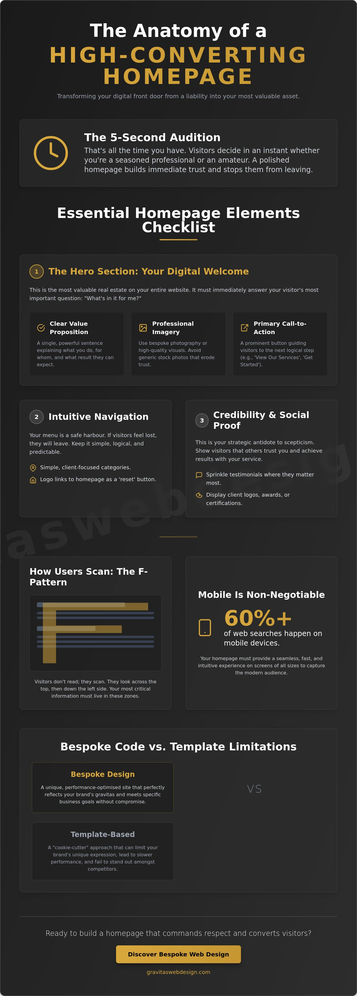
I get it. Between the conflicting DIY blogs and the technical jargon, trying to organise your site can feel like herding cats. You deserve a website that looks as polished as your actual work and actually brings in more enquiries. In this guide, I’ll show you how to turn that digital anxiety into a clear, professional plan. We’ll walk through the essential elements that build instant trust; from mobile optimisation, considering over 60% of searches now happen on phones, to the small details that make visitors feel safe enough to click.
Key Takeaways
- Understand the “front door” metaphor and how to bridge the human-to-human gap in a purely digital space.
- Get a definitive list of what to include on a business website homepage, starting with the high-value real estate of your “Hero” section.
- Learn how to use social proof as a strategic antidote to scepticism by sprinkling testimonials where they actually matter.
- Discover how to guide your visitors with conversion-focused copy that turns a casual scroll into a concrete enquiry.
- Weigh up the performance benefits of bespoke code versus the “cookie-cutter” limitations of standard website templates.
The 5-Second Audition: Why Your Homepage is Your Digital Front Door
Imagine walking into a high-end consultant’s office only to find a sticky floor, flickering lights, and a pile of old newspapers in the corner. You’d probably turn around and walk right back out before they even had a chance to say hello. Your website is no different. It’s your digital front door, and in the online world, you don’t get five minutes to make a case; you get about five seconds. This is the high-stakes audition where visitors decide if you’re a seasoned pro or a total amateur. When you look at What is a Homepage? through the lens of your brand, it’s the emotional bridge between a stranger’s problem and your expert solution.
It’s incredibly frustrating when your actual service is world-class but your website looks like a relic from the dial-up era. That gap between who you are and how you’re perceived online is where potential enquiries go to die. We call the antidote “professional gravitas”. It’s the quiet confidence that comes from a site that looks, feels, and functions like a premium service. When you are deciding what to include on a business website homepage, you’re not just ticking boxes. You are building a human-to-human connection. People don’t want to buy from a faceless corporate entity; they want to know there’s a real person behind the screen who actually gives a toss about their results.
The Psychology of a First Impression
Users don’t read websites like they read novels. They scan them like a menu at a busy cafe whilst looking for the “good stuff”. Most people follow an F-pattern, darting their eyes across the top and then down the left side, hunting for quick answers. If your layout is cluttered or confusing, it creates immediate cognitive friction. This is that “mental itch” that makes a visitor want to close the tab and try a competitor instead. There’s a sharp emotional contrast here. You want to feel professional pride when you share your link, not that cringey digital embarrassment that makes you want to hide your URL from everyone.
Navigation as a Safe Harbour
Think of your navigation menu as a safe harbour in a stormy sea of information. If a visitor feels lost, they’ll leave. A clear, intuitive menu is a non-negotiable part of what to include on a business website homepage. Keep your categories simple and organised around the natural questions a client might ask. Always ensure your logo links back to the start. It acts as a universal “reset” button that lowers visitor anxiety, giving them the freedom to explore your services without the fear of getting stuck in a digital dead-end.
The Essential Elements Checklist: What Every Business Homepage Needs
If your homepage is your digital front door, then the “Hero” section is the grand entrance hall. It is the most valuable real estate on your entire site. When people ask what to include on a business website homepage, they often get bogged down in the small stuff, but if you muck up the hero section, the rest won’t matter. This area needs to work hard. It requires a one-sentence value proposition that is absolutely non-negotiable. If a visitor has to play detective to figure out what you actually sell, they’ll just leave.
Professional imagery is your next hurdle. We’ve all seen those cheesy stock photos of people in suits shaking hands in a way no human has ever shaken hands. They look fake because they are. Real, bespoke photography or high-quality, curated visuals build rapport. They show you’re a real business with real people. If you’re feeling overwhelmed by the technical side of things, you can always chat with us about your project to see how we can bridge that gap.
The Hero Section: Value Proposition & Visual Identity
Your headline should answer one simple question: “What do you do for me?” It’s not about your company history; it’s about their future. A punchy headline paired with a cohesive visual identity, rather than just a lonely logo, creates a sense of established authority. This is why user experience (UX) design services in Birmingham always start with the hero section. It sets the emotional and visual tone for the entire visitor journey.
Service Overviews and Benefit-Driven Copy
Don’t dump your entire life story on the homepage. Instead, use service overviews as teasers. Summarise your complex offerings into digestible, clickable blocks that lead to deeper pages. Focus on the favourite outcomes your clients experience. Are they saving time? Are they finally sleeping at night? If you’re struggling with the wording, check out our guide on how to write service page copy that sells for a deeper dive into conversion tactics.
Finally, don’t ignore the footer. It’s the safety net for essential business info like your contact details, physical address, and links to your legal policies. Whilst the homepage is the star of the show, there are other essential pages for your small business website that help fill in the gaps for your more diligent visitors. Knowing exactly what to include on a business website homepage means balancing these high-energy sections with a solid, reliable foundation.
Building Instant Trust: Credibility Triggers and Social Proof
Let’s be honest: your visitors are a bit like cynical detectives. They aren’t just looking for reasons to hire you; they’re actively hunting for reasons to close the tab. In a world of digital smoke and mirrors, scepticism is the default setting. This is why social proof isn’t just a “nice to have” feature. It is the essential antidote to that nagging doubt in a potential client’s mind. When you’re deciding what to include on a business website homepage, think of trust as the glue that makes your sales message stick. Without it, even the flashiest design feels like a hollow shell.
One of the biggest mistakes we see is hiding testimonials away on a dusty “Reviews” page that nobody ever visits. If you want people to believe you’re the real deal, you need to sprinkle those wins throughout the scroll. Pair them with trust badges like professional memberships, industry awards, or even just the logos of brands you’ve helped. These act as mental shortcuts for your visitors, proving you’ve been vetted by others. Showing the “human” side of your business, perhaps through a quick photo of your team or a mention of your local roots, builds a level of rapport that a faceless corporate template simply can’t match.
Curating Impactful Testimonials
Not all reviews are created equal. Three specific, problem-solving quotes will always beat ten generic “great service, would recommend” blurbs. You want testimonials that describe a journey: “I was struggling with X, and this business delivered Y.” Using real names and, where possible, real photos adds a layer of authenticity that stops people in their tracks. It is about overcoming those digital myths that stop visitors from converting, like the idea that a pretty layout can replace genuine human evidence.
Local Signals: Establishing Roots in Birmingham and London
If you’re serving clients in specific areas like Birmingham or London, you need to prove you aren’t just a digital ghost. Including a physical address or a clearly defined service area in your footer or contact section proves you are a legitimate UK firm. A local phone number often carries more weight than a generic mobile or 0800 number because it suggests stability and presence. According to the guide on Website Basics for Small Businesses, keeping your content concise whilst grounding it in reality is key. Mentioning local landmarks or the specific types of businesses you help in the city helps build geographic relevance, making you the obvious choice for local leads who want a partner they can actually meet. Knowing exactly what to include on a business website homepage means making sure your local identity is front and centre.
Conversion-Focused Copywriting: How to Guide Visitors to Take Action
Imagine a visitor has scrolled through your entire page, nodding along to your message, only to reach the bottom and think, “Right, now what?” That is a conversion killer. Every single homepage needs a clear, primary mission. Whether you want a direct enquiry, a phone call, or a newsletter sign-up, you have to tell people exactly what to do next. When business owners get stuck wondering what to include on a business website homepage, they often forget that the page is a journey, not a destination. The Call to Action (CTA) is the logical conclusion of that journey.
Professional copywriting is the secret sauce here. It is an investment in your conversion rate that pays off far longer than a flashy animation ever will. Good copy doesn’t just describe what you do; it speaks to the visitor’s pain and offers a hand up. To make this text effective, you need “white space”. Think of it as breathing room for the brain. If you cram every square inch with text, your message gets lost in the noise. Use space to let your buttons and headlines stand out. If you’re ready to stop losing leads to a cluttered layout, you can start building your high-converting homepage today with a plan that actually works.
Crafting Compelling Calls to Action
Your buttons should never just say “Submit” or “Click Here”. Those are chores. Instead, use active verbs that promise a benefit, like “Start Your Project” or “Get My Free Guide”. It is also wise to use a “Primary vs Secondary” CTA strategy. Your primary button is for the people ready to buy right now. Your secondary button (perhaps a “Learn More” link) is for the researchers who need a bit more convincing. Ensure your primary button colour stands out against your background whilst staying firmly within your brand guidelines so it’s impossible to miss.
The Flow of Information: A Logical Journey
The sequence of your content matters. A high-converting homepage follows a simple three-step rhythm. First, identify the problem your client is facing. Second, present your service as the clear solution. Third, prove it works with the social proof we discussed earlier. A common trap is making the “About” section on the homepage a long-winded autobiography. In reality, that section should still be about the client. It should explain how your history and expertise make you the best person to solve *their* specific problem. Keep your paragraphs short and punchy to maintain a fast communication rhythm that keeps people scrolling. Knowing what to include on a business website homepage is half the battle; the other half is making sure the information flows in a way that feels like a natural conversation.
Bespoke vs Template: Making Your Homepage Stand Out Amongst the Noise
Have you ever visited a website and felt a strange sense of déjà vu? It’s that nagging feeling that you’ve seen this exact layout, these exact icons, and this exact “vibe” a dozen times before. That is the template trap. Whilst DIY builders promise a quick fix, they often leave you with a “cookie-cutter” look that lacks the professional gravitas we’ve been talking about. When you’re deciding what to include on a business website homepage, the “how” is just as important as the “what”. A bespoke build isn’t just about looking pretty; it’s about performance, personality, and proving you aren’t just another generic entry in a crowded market.
A custom build allows your branding to breathe. It ensures your visual identity is baked into the code, not just slapped on top of a rigid framework. This level of detail is what turns a casual visitor into a loyal client. Beyond the aesthetics, a high-quality, bespoke build makes long-term maintenance a breeze. You aren’t fighting against a bloated system designed to please everyone; you’re driving a sleek machine built specifically for your unique business goals.
The Hidden Costs of “Easy” Templates
Templates are often packed with “kitchen sink” code. They include every possible feature just in case someone needs it, which leads to slow load speeds and a miserable experience for mobile users. With over 60% of online searches now coming from mobile devices, a clunky template isn’t just an annoyance; it’s a liability. Since speed is a major factor in SEO rankings, a bloated site can actively hide you from potential clients. There’s also the inevitable frustration of hitting a creative “wall”. You want to move a button or change a layout, but the template says “no”. This is why bespoke web design in Birmingham is such a powerful long-term asset. It removes the shackles and lets your digital presence grow alongside your ambition.
Future-Proofing Your Digital Presence
Your business won’t stay the same size forever, and your website shouldn’t either. Scalable architecture is vital. You need a site that can handle more traffic, more services, and more complex enquiries without breaking a sweat. Security is another biggie. By avoiding the common vulnerabilities of popular, mass-market templates and hosting on premium UK servers, you protect your reputation and your data. At Gravitas Web Design, we pride ourselves on removing the “industry-standard awkwardness” of site builds. We focus on speed, ease, and helping you feel genuinely proud of your URL. Knowing what to include on a business website homepage is the first step, but choosing a bespoke foundation ensures that those elements actually work for you for years to come.
Turn Your Digital Front Door into a Lead-Generating Powerhouse
You’ve now got the definitive checklist for your site. You know that a hero section needs to do the heavy lifting and that social proof is the essential antidote to visitor scepticism. Deciding what to include on a business website homepage doesn’t have to feel like a stressful DIY project that never ends. It’s about moving away from those bloated, slow templates and focusing on a bespoke experience that truly reflects the quality of your work. No more cringing when you share your link; it’s time for professional pride.
If you’re tired of the industry-standard awkwardness and want a site that makes you feel proud, we’re here to help. Our bespoke Birmingham-based design team specialises in a transparent, jargon-free process that covers everything from end-to-end SEO to professional copywriting support. We’ll handle the technical heavy lifting so you can focus on running your business. Ready to build a homepage that actually works? Let’s talk bespoke design.
Your business deserves a digital presence that looks as polished as your actual service. You’ve got the plan; now it’s time to make it happen.
Frequently Asked Questions
How much content should I actually have on my homepage?
Aim for 500 to 1,000 words to ensure you have enough space to build trust whilst keeping search engines happy. It is about quality over quantity. Every sentence should earn its keep. If a paragraph doesn’t help a visitor understand your value or take the next step, it’s just digital clutter. Keep things scannable with punchy headings so users can find what they need without feeling overwhelmed.
Do I really need professional photos, or can I use my phone?
Professional photography is always the gold standard for building instant trust, but a high-end modern smartphone can work in a pinch. The key is lighting and composition. Avoid grainy, dark, or cluttered shots that make your business look amateur. If your service is premium, your visuals need to match that level of quality to avoid the “cringe factor” when you share your URL with a new contact.
Where is the best place to put my contact information?
Your contact details belong in the header, the footer, and ideally a dedicated section just above the bottom of the page. Visitors shouldn’t have to hunt for a way to reach you. Including a local phone number and a professional email address in these high-visibility spots proves you’re a legitimate, reachable business. It’s a small detail that makes a massive difference in how credible you appear to a lead.
Should I include my prices on the homepage?
You don’t necessarily need exact prices on the homepage, but providing a “starting from” figure or a typical range can help qualify your leads. If your services are completely bespoke, focus on the value and the specific problem you solve instead. Transparency is great, but don’t let a complex pricing table distract from the emotional connection you’re trying to build in those first few seconds of the audition.
How many Calls to Action are too many?
Stick to one primary Call to Action and one secondary “softer” option to avoid overwhelming your visitors. When deciding what to include on a business website homepage, remember that too many buttons create confusion. You want to lead the visitor down a single, clear path. If you ask them to do five different things at once, they’ll likely end up doing nothing at all and leaving your site.
Is it better to have a long-scrolling homepage or a short one?
A long-scrolling homepage is generally better because it allows you to tell a complete story and include more credibility triggers. It gives you the space to identify the problem, present your solution, and prove your success with social proof. Short homepages often feel like a digital dead-end. As long as the content is punchy and well-organised, visitors are usually happy to scroll through a well-designed, logical narrative.
How often should I update the elements on my homepage?
You should review your homepage quarterly to ensure your testimonials and offers are still fresh and relevant. A stagnant site can look like a business that has closed its doors. Regular updates to what to include on a business website homepage, such as adding a recent client win or refining your headline, keep the site feeling alive. It also tells search engines that your digital presence is active and well-maintained. If your existing content feels outdated or isn’t performing as expected, investing in a website content audit service can help you identify exactly what needs refreshing to reclaim your visibility and stop that digital leak.