
Web Design Blog
What Makes a Website Look Professional? The Anatomy of Digital Credibility
Here’s an uncomfortable truth: your website might be quietly costing you clients every single day. Not because it’s broken, not because it’s hard to find, but because something about it just doesn’t feel right. Visitors land on it, get a vague sense of unease, and click away before you’ve had a chance to say a word. That nagging question, “why does my competitor’s website look so much more expensive and trustworthy than mine?”, is exactly what this article is here to answer.
You already know that first impressions matter. You feel it every time you visit a polished, confident website and instinctively trust the business behind it. So it’s completely reasonable to worry that your own site isn’t doing you justice, especially when you know the quality of your work tells a very different story.
Understanding what makes a website look professional isn’t really about chasing trends or ticking boxes on a design checklist. It’s about the invisible alignment of bespoke design, strategic branding, and technical detail that works together to create an instant gut feeling of credibility. In this article, we’ll break down every element that contributes to that feeling, in plain English, so you leave with a clear picture of exactly where to focus your energy.
Key Takeaways
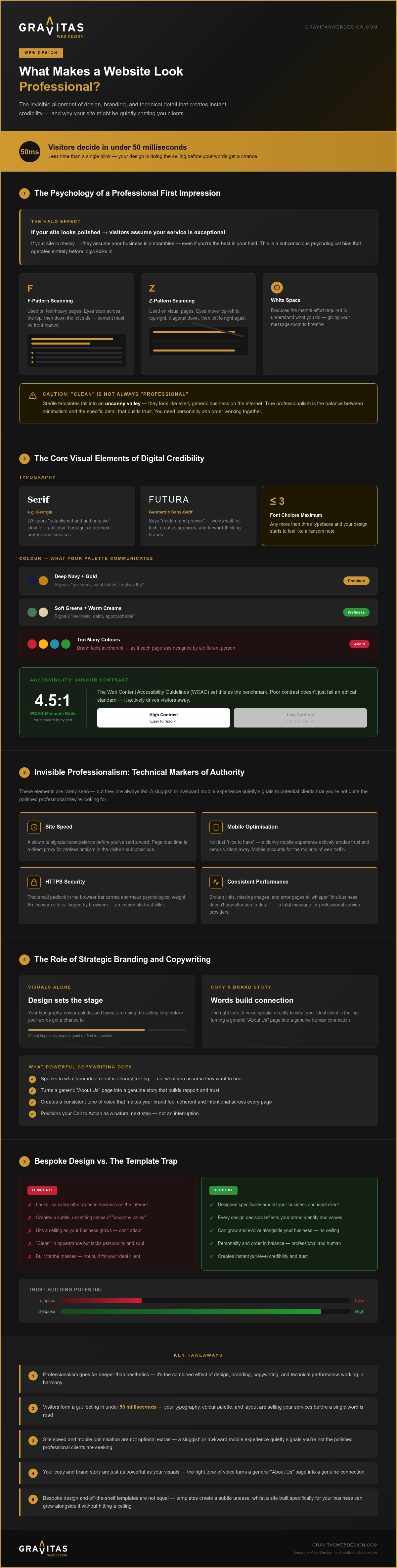
- Understanding what makes a website look professional goes far deeper than aesthetics — it’s the combined effect of design, branding, copywriting, and technical performance working in harmony to create instant credibility.
- Visitors form a gut feeling about your website in under a second, which means your typography, colour palette, and layout are doing the selling long before your words get a chance to.
- Technical details like site speed and mobile optimisation aren’t just “nice to haves” — a sluggish or awkward mobile experience quietly signals to potential clients that you’re not quite the polished professional they’re looking for.
- Your copy and brand story are just as powerful as your visuals; the right tone of voice speaks directly to what your ideal client is feeling, turning a generic “About Us” page into a genuine connection.
- Bespoke design and off-the-shelf templates are not equal — discover why templates often create a subtle sense of unease, and how a site built specifically for your business can grow alongside it without hitting a ceiling.
The Psychology of a Professional First Impression
Visualise walking into a boutique hotel where the carpet is frayed and the lobby smells faintly of damp. You would probably turn around before even reaching the check-in desk, wouldn’t you? Your website works in exactly the same way. Professionalism isn’t just a corporate buzzword; it’s the immediate projection of competence and reliability that settles a visitor’s nerves. When we explore what makes a website look professional, we’re really looking at a silent conversation where your design proves you’re the expert you claim to be.
You don’t have minutes to win someone over. You have about 50 milliseconds. That’s less time than it takes to blink. In that tiny window, a visitor decides if they stay or sprint for the “back” button. This triggers the “Halo Effect,” a psychological bias where we assume that if one thing looks good, everything else must be good too. If your site is polished, users subconsciously believe your service is exceptional. If it’s messy? They’ll assume your business is a bit of a shambles, too (even if you’re actually the best in the business).
The “Gut Reaction” and Visual Hierarchy
Good design isn’t about throwing everything at the wall to see what sticks. It’s about using established web design principles to guide the eye exactly where it needs to go. We use white space to give your message room to breathe, which reduces the mental effort required to understand what you do. Most people don’t read; they scan. They follow an F-pattern on text-heavy pages or a Z-pattern on more visual ones. By using contrast and scale, we make your Call to Action (CTA) impossible to miss without being obnoxious about it. It’s about being a helpful guide rather than a shouting salesman.
Why “Clean” Isn’t Always “Professional”
There is a dangerous trap in the design world: the sterile template. These sites are “clean,” sure, but they often lack a soul. They fall into an “uncanny valley” where they look like every other generic business on the internet. To understand what makes a website look professional, you have to balance minimalism with the specific information that builds trust. You need enough personality to show there’s a human behind the screen, whilst maintaining the order that suggests you know your craft inside out. Visual credibility is the seamless intersection of aesthetic pleasure and effortless navigation that tells a visitor they are in safe hands.
The Core Visual Elements of Digital Credibility
Think of your website’s visual elements like the outfit you wear to a client pitch. The wrong combination, even if each piece is technically fine on its own, sends a message you didn’t intend. When we talk about what makes a website look professional, we’re really talking about the cumulative effect of dozens of small visual decisions that either build trust or quietly erode it.
Typography and Colour Palettes That Command Respect
Fonts carry personality. A serif typeface like Georgia whispers “established and authoritative,” whilst a geometric sans-serif like Futura says “modern and precise.” Neither is inherently better; the question is whether your font choice is having the right conversation with your ideal client. The golden rule? Stick to two, maybe three, font choices across your entire site. Any more than that and your design starts to feel like a ransom note.
Colour works the same way. Your palette isn’t just decoration; it’s a shorthand signal. Deep navy and gold say “premium.” Soft greens and warm creams say “wellness and calm.” The trap many businesses fall into is picking colours they personally love rather than colours that resonate with the people they’re trying to attract. Worse still, some sites use so many colours that the brand feels incoherent, like every page was designed by a different person on a different day.
Accessibility matters here too, and not just for ethical reasons. Poor colour contrast between text and background makes your site genuinely difficult to read for a significant portion of your audience. A site that’s hard to read is a site people leave. The Web Content Accessibility Guidelines (WCAG) recommend a contrast ratio of at least 4.5:1 for standard body text, and it’s a standard worth taking seriously.
The Death of the Generic Stock Photo
You know the ones. The suspiciously perfect team gathered around a laptop, all laughing at the same spreadsheet. Or the lone businessperson striding confidently across a marble lobby. These images don’t just fail to impress; they actively damage credibility. Visitors have seen them a thousand times on a thousand different websites, and the moment they clock a familiar stock photo, the trust you’ve been building evaporates.
Bespoke photography, even a simple set of well-lit shots of your actual workspace or your real team, does something no stock library can replicate: it proves you exist. It shows the human being behind the service. Research by the Nielsen Norman Group on first impressions in web design consistently highlights that authenticity in imagery is a significant driver of perceived trustworthiness.
And if photography isn’t an option right now, thoughtfully designed custom illustrations or icons can be a genuinely elegant alternative. They simplify complex service offerings into digestible visuals and, crucially, they’re yours. Nobody else’s website will have them.
Consistency ties all of this together. Every page of your site should feel like it belongs to the same family: same fonts, same colours, same image style, same tone. Inconsistency is the visual equivalent of a business that can’t quite get its story straight. If you’re ready to get this right from the ground up, working with a bespoke design team means every element is crafted to work in harmony, rather than bolted together and hoped for the best.
Invisible Professionalism: Technical Markers of Authority
Here’s something the purely visual conversations about what makes a website look professional almost always miss: some of the most damaging credibility killers are completely invisible to the eye. They’re felt rather than seen. A site that loads like it’s wading through treacle, a layout that crumbles on a mobile screen, or that ominous “Not Secure” warning in the browser bar — these are the silent deal-breakers that send potential clients running before a single word of your carefully crafted copy has been read.
Speed and the “Clunky” Factor
Slow websites feel amateur. It’s that simple. Research into first impressions and digital credibility consistently shows that users make snap judgements about a site’s quality almost instantly, and a sluggish load time poisons that judgement before the page has even appeared. Premium hosting plays a significant role here; cheap, shared hosting environments are the digital equivalent of a dial-up connection, and your visitors will feel every painful second of it. Properly optimised images, clean code, and minimal bloated scripts are what separate a site that glides from one that groans. Every unnecessary fraction of a second you shave off your load time is a fraction of a second more trust you’re earning.
Mobile First vs. Mobile Responsive
There’s a meaningful difference between a site that technically works on a phone and one that was actually designed for it. “Responsive” used to be enough. It isn’t anymore. A genuinely mobile-first approach means thinking about the thumb before the mouse: navigation that’s easy to tap without squinting, buttons that don’t require the precision of a surgeon, and text that doesn’t demand a pinch-and-zoom workout. Intrusive pop-ups that swallow the entire screen the moment someone arrives? A professional site doesn’t do that. It respects the visitor’s experience regardless of the device they’re holding.
Then there’s security. If your site still shows “Not Secure” in the Chrome address bar, you might as well hang a sign outside your shop saying “we’re not quite sure what we’re doing.” An SSL certificate is non-negotiable. It’s the digital equivalent of a locked front door, and without it, browsers actively warn visitors away from your site.
This is exactly where ongoing maintenance earns its keep. A beautiful website that’s left to gather digital dust will eventually become a liability: outdated plugins, security vulnerabilities, and performance decay creeping in quietly. WordPress maintenance services in Lichfield exist precisely to protect the investment you’ve made in your site, keeping it fast, secure, and performing at its best long after launch day. Professionalism isn’t a one-time achievement. It’s something you maintain.
The Role of Strategic Branding and Copywriting
Here’s the thing that most conversations about what makes a website look professional completely gloss over: your words matter just as much as your design. A beautifully built site with weak, generic copy is like a luxury car with a broken engine. It looks the part, but it’s not going anywhere. Branding and copywriting aren’t the finishing touches you bolt on at the end; they’re the engine that makes the whole thing move.
Speaking Your Client’s Language
Your ideal client isn’t searching for a “synergistic solutions provider.” They’re searching for someone who understands their specific headache and can fix it. Professional copy speaks directly to that headache, in plain language, without drowning the reader in industry jargon. The most powerful thing your homepage can do is make a visitor feel genuinely understood within the first few seconds. That starts with a clear, singular Value Proposition: one sentence that tells them exactly what you do, who you do it for, and why that matters. Not three sentences. Not a paragraph. One. Nail that, and you’ve already done more than most of your competitors.
Persuasive copywriting then guides that visitor from “this looks interesting” to “I need to get in touch,” turning passive browsers into active enquiries.
The “About Us” Page Nobody Reads (and How to Fix It)
Most About Us pages are a CV dressed up as a web page. Year founded, list of qualifications, a photo of the team squinting into the sun. Visitors don’t care, and they’ll prove it by clicking away immediately. What they actually want is a story: why you started, what you genuinely believe in, and why any of it matters to them. A compelling brand story transforms a forgettable page into the moment a potential client thinks, “yes, these are my people.”
Consistency Across Your Digital Estate
Your website, social profiles, and logo should feel like they all came from the same family. When they don’t, the subconscious message is that your business lacks coherence, and that’s a trust problem. Which brings us to the logo. A DIY logo can quietly undermine even the most expensive web design, because it’s the first thing people see and the last thing they remember. It’s the cornerstone of your entire visual identity. A professionally designed logo isn’t just a pretty mark; it’s a strategic asset that communicates your values before a single word is read. If you’d like to understand exactly why this matters, professional logo design and strategic branding go hand in hand in building the kind of consistent identity that earns long-term loyalty from your local customers.
Branding consistency builds familiarity. Familiarity builds trust. Trust turns first-time visitors into repeat clients. Ready to get your brand and copy working together properly? Start the conversation with Gravitas Web Design today.
Bespoke Design vs. The Template Trap
Picture two restaurants side by side. One has a menu printed on the same laminated card you’ve seen in a dozen other places. The other has a menu designed specifically for them, reflecting exactly who they are. You know instantly which one feels more considered. Websites work the same way, and this is perhaps the most overlooked dimension of what makes a website look professional: whether the site was built around your business, or whether your business was squeezed into someone else’s mould.
Templates have an “uncanny valley” problem. They’re not broken. They’re not ugly. They just feel slightly off, in the same way a wax figure looks almost human but not quite. Visitors can’t always articulate why, but they feel it. That’s because templates are designed to work for everyone, which means they’re perfectly optimised for no one. The result is a site that looks familiar in all the wrong ways, blending into a sea of competitors rather than standing apart from them.
Why Your Business Outgrows Off-the-Shelf Solutions
The hidden costs of “free” or cheap templates tend to reveal themselves slowly. SEO limitations baked into the theme’s code structure. Customisation that hits a wall the moment you need something specific. Bloated scripts from features you’ll never use, quietly dragging your load speed down. A bespoke site, built from the ground up, creates a unique user journey designed around how your specific leads actually think and behave. It’s the difference between a suit off the rack and one made to measure. Both cover the basics. Only one makes you look like you mean business.
The competitive advantage is real, too. If your closest competitor is using the same Wix template as three other businesses in your area, the moment you invest in something built specifically for you, the contrast is immediate and striking. You don’t just look more professional; you look like the obvious choice.
Knowing when to make that move is the key question, and it’s worth reading the full guide on when to move from a template to a bespoke website to understand the specific signals that tell you it’s time.
Partnering with a Straight-Talking Agency
The agency relationship matters as much as the end product. A transparent process, one where your business goals drive every decision rather than a designer’s personal aesthetic preferences, produces sites that actually convert. No jargon. No mysterious “creative process” that leaves you in the dark for weeks. Just a genuine, human-to-human conversation about what you need and how to get there.
That’s exactly the approach at Gravitas Web Design. Based in Sutton Coldfield and working with businesses across Birmingham, Lichfield, and beyond, the focus is always on building something that works hard for your business, not just something that looks pretty in a portfolio. If you’re ready to leave the template trap behind for good, explore bespoke web design in Birmingham and find out what a site built specifically around your goals can do.
Your Website Should Be Working as Hard as You Do
Understanding what makes a website look professional isn’t one single thing. It’s the combined weight of smart visual choices, technical performance that doesn’t let you down, copy that speaks directly to the right people, and a design built specifically around your business rather than borrowed from a template shelf.
The businesses that win online aren’t necessarily the best at what they do. They’re the ones whose websites make that obvious within seconds. That’s the gap worth closing.
At Gravitas Web Design, everything sits under one roof: bespoke design, SEO, branding, copywriting, and ongoing maintenance. No jargon, no mysterious processes, and no templates dressed up as something they’re not. Just a straight-talking team genuinely invested in making your business look like the obvious choice.
You’ve already done the hard work of building something worth being proud of. Let your website say so. Get a straight-talking quote for your bespoke web design and find out exactly what’s possible.
Frequently Asked Questions About What Makes a Website Look Professional
How much does a professional website cost in the UK?
Pricing varies enormously depending on whether you’re looking at a template-based build or a bespoke solution. A DIY website builder might cost very little upfront but carries hidden costs in lost credibility and limited flexibility. A professionally designed bespoke website from a specialist agency is a more significant investment, but it’s built to convert visitors into enquiries rather than simply exist on the internet. The honest answer is: get a proper quote based on your specific goals, because the right question isn’t “how much does it cost?” but “what will it earn?”
Can I make my current website look professional without a full redesign?
Sometimes, yes. If your site’s structure is fundamentally sound, targeted improvements to typography, colour consistency, imagery, and copywriting can meaningfully lift its credibility. Start by replacing any generic stock photos, tightening your font choices to two maximum, and ensuring your homepage leads with a clear value proposition. That said, if the underlying template is fighting you at every turn, or if the site is genuinely slow and difficult on mobile, incremental fixes can only take you so far before a proper rebuild becomes the smarter investment.
How long does it take to build a bespoke professional website?
A well-built bespoke website typically takes between six and twelve weeks from initial briefing to launch, though this depends heavily on the complexity of the project and how quickly content and feedback are provided on the client side. Rushing the process is rarely worth it; the planning stage, where your audience, goals, and user journey are properly mapped out, is what separates a site that looks good from one that actually performs. A transparent agency will give you a clear timeline upfront rather than vague promises.
Do I really need professional copywriting for my website?
Yes, and this is probably the most underestimated element of what makes a website look professional. Beautiful design with weak copy is like a stunning shop window displaying the wrong products; it attracts attention but doesn’t close the sale. Professional copywriting ensures your value proposition is crystal clear within seconds, your tone speaks directly to your ideal client’s specific concerns, and every page has a purpose that moves visitors closer to getting in touch. It’s not a luxury add-on; it’s a core part of the conversion engine.
What is the difference between a template and a bespoke web design?
A template is a pre-built design framework that thousands of other businesses can purchase and use. It’s adapted to fit your content, but it wasn’t built around your business, your clients, or your specific goals. Bespoke web design starts with a blank canvas and builds every element specifically for you: the user journey, the layout, the functionality, and the visual identity. The practical difference shows up in performance, flexibility, and that intangible sense of authority that visitors pick up on immediately, even if they can’t quite explain why.
Why is my website not converting visitors into enquiries?
The most common culprits are a weak or absent value proposition, unclear calls to action, and a user journey that makes visitors work too hard to understand what you do or how to contact you. Trust signals matter too; if your site lacks social proof such as testimonials or case studies, visitors have no evidence that you deliver on your promises. It’s also worth checking your load speed and mobile experience, as a technically poor experience quietly signals unprofessionalism before a single word is read.
Is mobile optimisation really that important for professional services?
Absolutely. A substantial proportion of web browsing now happens on mobile devices, and search engines actively favour mobile-friendly sites in their rankings. For professional services specifically, a clunky mobile experience sends a particularly damaging signal: if you can’t get your own digital presence right, why would a potential client trust you with theirs? There’s also a meaningful difference between a site that technically scales to a smaller screen and one that was genuinely designed for it, with thumb-friendly navigation, readable text, and no intrusive pop-ups hijacking the experience.
How often should I update my website to keep it looking professional?
Think of your website like a car: it needs regular servicing to stay roadworthy, not just a clean every few years. At a minimum, your content should be reviewed every few months to ensure it accurately reflects your current services, pricing, and team. Behind the scenes, software updates, security patches, and performance checks should happen far more frequently. A site left untouched for a year or more accumulates vulnerabilities and performance decay that visitors will feel even if they can’t see them. Ongoing maintenance isn’t optional; it’s how you protect the investment you’ve made.