
Web Design Blog
How to Create a Brand Style Guide: The Essential Handbook for Growing UK Businesses
Imagine you’re about to send a proposal to a high-value client, but you stop dead. Is that the right shade of navy? Why does the logo look slightly squashed on your mobile site? It’s that familiar, prickly heat of brand embarrassment creeping in again. You know your business is brilliant, but your online presence feels like a messy patchwork of “near enough” colours and fonts that don’t quite match. Learning how to create a brand style guide is the only way to stop the guesswork and finally look like the authority you are.
We’ve all been there, staring at a blank screen or trying to explain your vision to a freelancer who simply doesn’t get it. It’s exhausting wasting hours on tiny design decisions when you should be leading your team. This handbook acts as your business’s North Star, turning that design anxiety into total creative confidence. We will walk through the essential elements of a professional guide; from setting your core palette to defining a voice that actually sounds like you. By the end, you’ll have a clear PDF that ensures your business looks credible, cohesive, and ready to win over those high-value clients.
Key Takeaways
- Stop the “near enough” colour mismatch and use your style guide as a “North Star” to eliminate design anxiety for good.
- Master how to create a brand style guide by first defining your “Brand Soul,” ensuring every font and colour choice feels intentional and authoritative.
- Build a versatile visual toolkit that keeps your logo and typography looking sharp on everything from a London billboard to a tiny smartphone icon.
- Protect your brand’s authentic “vibe” by setting clear rules for AI-generated assets, ensuring you maintain a human connection as technology evolves.
- Learn how to turn your style guide into a living document that your team actually uses, making professional consistency the easiest path forward.
What is a Brand Style Guide (and Why Does Your Business Feel Chaotic Without One?)
Have you ever looked at your business’s Facebook page and then your website, only to feel a slight twitch in your eye? If your social media is all neon pinks and emojis whilst your website looks like a dry tax audit, you’re suffering from “Brand Drift”. It’s that awkward disconnect that happens when you don’t have a plan. Essentially, a brand style guide is a living document that codifies your business’s visual and verbal personality. Learning how to create a brand style guide is the first step toward reclaiming your professional pride and ending the visual identity crisis for good.
If you’re wondering exactly what is a style guide in a broader sense, it’s a set of standards for the design and writing of documents. For your business, it’s the “North Star” for anyone creating content on your behalf. Whether it’s a senior designer or a new intern, they should be able to look at this guide and know exactly how to represent you. It takes the guesswork out of every tweet, flyer, and email signature. Ultimately, a brand style guide is the ultimate insurance policy against unprofessionalism, protecting your reputation every time you hit “publish”.
The Real Cost of Visual Inconsistency
When your branding is “chopped and changed” every other Tuesday, you’re subtly whispering to potential clients that you might be a bit unorganised. If you can’t keep your own colours straight, how will you manage their high-value project? It’s also a massive productivity killer. Staring at a colour wheel for twenty minutes trying to find “that one blue” for a flyer is a waste of your brilliant brain. Consistency is the fastest shortcut to building trust, whether you’re pitching to high-value London property firms or locals in Lichfield. People buy from businesses that look like they have their act together.
Who Actually Uses This Document?
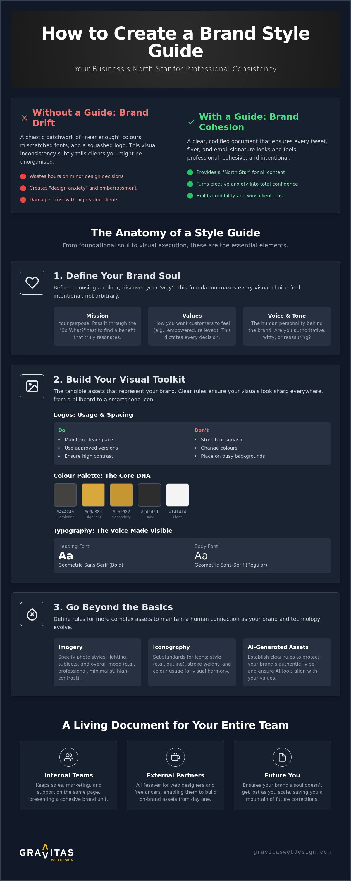
It isn’t just a shiny PDF for you to admire. Your internal teams need it to stay on the same page. When sales, marketing, and customer service all use the same tone and visuals, your brand feels like one cohesive unit. It’s also a lifesaver for external partners. When you hire a bespoke web design Birmingham agency, giving them a style guide means they can build a site that fits you like a glove from day one. Finally, it’s for the “Future You.” As you scale from a solo venture to a larger firm, this document ensures your brand’s soul doesn’t get lost in the growth. Understanding how to create a brand style guide now saves you a mountain of awkward corrections later.
Defining Your Brand Soul: Mission, Values, and the Human Voice
Before you spend three hours debating whether “Midnight Navy” or “Oxford Blue” better represents your business, stop. Those visual choices mean nothing if they aren’t anchored to your brand’s soul. When you’re figuring out how to create a brand style guide, your first job isn’t design; it’s discovery. You need to know why you exist and who you’re actually talking to. Your “Brand Soul” is the foundation that makes your visual choices feel intentional rather than arbitrary. Without it, you’re just picking pretty colours; with it, you’re building an identity.
We believe in a “Human-to-Human” connection. Whether your clients are based in Sutton Coldfield or the heart of London, they don’t want to buy from a faceless, corporate machine. They want to buy from someone they trust. Using standards to boost brand consistency helps build that trust, but that consistency starts with your values. Forget corporate-speak. Focus on how you want your customers to feel after they interact with you. Do they feel relieved? Empowered? Excited? That emotional response should dictate every decision you make.
Crafting a Relatable Mission Statement
Forget the “we strive for excellence” clichés. It’s a tired phrase that says absolutely nothing to a potential client. Instead, put your mission through the “So What?” test. If you say you’re “innovative,” ask yourself “so what?”. If the answer is “so our clients save four hours a week on admin,” you’ve found a mission that actually resonates. A clear, honest mission helps you say “no” to projects or design trends that don’t fit your identity. It keeps you focused on the real-world benefits you provide to the people who pay you.
Finding Your Brand Voice and Tone
Your brand voice is your personality; it stays the same. Your tone is like your volume; it changes depending on the situation. When documenting how to create a brand style guide, remember that your voice is the soul of your copy. Are you the straight-talking partner or the creative innovator? Choose three to five adjectives and stick to them. A great exercise for your handbook is a “We’re this, not that” list. For example:
- We are professional but not stuffy.
- We are energetic but not frantic.
- We are experts but not condescending.
If you’re struggling to pin down your brand’s unique voice, it might be time to chat with a branding expert who can help uncover what makes your business tick.
The Visual Toolkit: Logos, Colour Palettes, and Typography
This is the “meat” of your handbook. It’s where you define the specific assets that make your business instantly recognisable in a crowded inbox or a busy high street. Your visual identity needs to be a workhorse; it should be robust enough for a massive billboard in London but simple enough to stay legible as a tiny favicon in a browser tab. When you are documenting how to create a brand style guide, you must include clear “Do and Don’t” examples. This prevents well-meaning team members from stretching your logo or using hideous neon greens that make your clients wince. Ultimately, professional logo design London serves as the anchor for this entire toolkit, setting the standard for every other visual choice you make.
Logo Usage and Sacred Space
Your logo needs room to breathe. In design terms, we call this the “exclusion zone” or sacred space. It’s the minimum amount of clear space that must surround your logo to keep it looking professional and uncluttered. You should also define your primary logo versus secondary versions. Sometimes the full version is too much for a small social media profile picture; that’s when a simplified icon version saves the day. Don’t forget background rules. You need to specify how your logo behaves on dark, light, or busy photographic backgrounds so it never gets lost in the noise.
Building an Accessible Colour Palette
A great palette isn’t just about your favourite shade of teal. You need primary colours for instant brand recognition and secondary colours for accents and variety. To ensure your “Gravitas Grey” looks identical on a smartphone screen and a printed brochure, you must list the HEX, RGB, and CMYK codes. If you look at the University of California brand guidelines, you’ll see how meticulously they standardise these values across their various campuses. We also need to talk about accessibility. Ensure your colour combinations have enough contrast so that everyone, including users with visual impairments, can actually read your content.
Typography: Choosing Fonts with Personality
Fonts carry a huge amount of emotional weight. You want a header font that grabs attention and reflects your personality, paired with a body font that prioritises readability over everything else. Limit yourself to two or three fonts at most. Using more makes your website look like a ransom note rather than a professional business. Establish a clear hierarchy; define how your H1, H2, and body text should be sized and styled. This guides the reader’s eye and makes your information digestible. Learning how to create a brand style guide that masters these basics will transform your digital presence from amateur to authority.
Beyond the Basics: Imagery, Iconography, and the Modern AI Frontier
Imagine scrolling through your Instagram feed and stopping at a photo that just feels like your favourite local brand. You haven’t seen a logo yet, but the lighting, the mood, and the subject matter tell you exactly who it is. That’s the power of imagery standards. When you sit down to figure out how to create a brand style guide, you have to look beyond the logo and the fonts. You’re building a visual language that speaks even when you aren’t using words. At Gravitas, we lean into radical transparency; we want you to show the messy, wonderful reality of your business rather than hiding behind polished, soul-less stock photos of people pointing at tablets in glass boardrooms.
Consistency in your imagery ensures that your brand remains recognisable across every digital touchpoint. Whether it’s a bespoke icon set or the way you frame your team photos, these details build a layer of professional polish that templates simply can’t replicate. It’s about creating a “vibe” that your audience in Birmingham or London can connect with instantly. This section of your handbook is where you draw the line between looking like a generic startup and looking like a seasoned authority.
Setting the Standard for Photography
Start by defining the “mood” of your photos. Are they warm, sun-drenched, and inviting? Or are they cool, clinical, and high-contrast? Choose a direction and stick to it. You should also decide on your subject matter. Do you focus on the polished, finished projects, or do you share the behind-the-scenes reality of your workshop or office? Consistency in filters and lighting is the secret sauce for a professional Instagram grid. It builds immediate credibility because it shows you pay attention to the details. If your photos are a hodgepodge of different styles, your brand will feel just as fragmented.
Brand Integrity in the Age of AI
With the widespread adoption of automated creative tools, you must address the AI frontier in your guide. AI is a brilliant tool for speed, but your brand style guide is the filter that ensures it doesn’t dilute your identity. You need to set clear boundaries for AI-generated imagery. What feels “on-brand” and what looks “too fake”? If you’re using AI to help draft copy, your guide should remind you to always “humanise” the output. The goal is to use technology to scale your efforts whilst keeping that essential human-to-human connection at the centre of everything you do.
If you’re ready to move past the generic and build a brand that truly reflects your business’s soul, get started with our branding team today and let’s create something remarkable together.
Bringing Your Guide to Life: Implementation and Staying Consistent
A style guide is useless if it sits in a forgotten folder on your desktop, gathering digital dust. It’s a bit like buying a fancy gym membership and then never leaving the sofa; the intent is lovely, but the results simply won’t follow. Successful implementation is about making the right choice the easiest choice for your team. If your staff or freelancers have to hunt through six nested subfolders just to find a high-res logo, they’ll eventually give up and grab a blurry version from an old email. When you are mastering how to create a brand style guide, you aren’t just designing a PDF; you’re designing a workflow that protects your professional reputation.
Think of your guide as a living entity. It isn’t a set of handcuffs designed to stifle creativity, but a safety net that catches mistakes before they reach the public eye. In the fast-paced UK market, where competition is fierce from the Midlands to the capital, that consistency is what separates the amateurs from the authorities. It’s about building a culture where everyone feels like a guardian of the brand’s soul.
The Rollout: From PDF to Daily Practice
Start by organising your assets into a dedicated “Brand Kit”. This should be a single, cloud-based folder containing your logos, fonts, and the guide itself. Make it the only place people go for assets. We also advocate for a “Brand Induction” for every new hire or external partner. Take 30 minutes to walk them through the document. Explain the “human-to-human” connection we discussed earlier so they understand the emotional weight behind your choices. Finally, perform a brand audit. Check your email signatures, your LinkedIn banners, and your physical signage. If it doesn’t match the guide, change it. It’s a one-time effort that pays dividends in credibility.
Evolution vs. Revolution
Don’t be afraid to evolve. Your guide should grow whilst maintaining its core DNA. You don’t always need a total revolution; often, a subtle “Brand Refresh” is enough to keep you looking modern. Gather feedback from your loyal clients in Sutton Coldfield or London. Ask them if your visuals still reflect the value you provide. Their honest perspective is a brilliant compass for your next steps. We recommend a formal review of your style guide every 12 to 18 months. This keeps you fresh without alienating the audience that already knows and trusts you. Once your branding is solid and your team is aligned, the natural next step is looking at when to move from a template to a bespoke website to ensure your digital home is as unique as your brand.
Your Path from Amateur to Authority Starts Here
You’ve walked through the “meat” of the visual toolkit and discovered the soul of your business. You now know that how to create a brand style guide is more about intentionality than just picking pretty colours; it is about building an insurance policy for your reputation. By defining your unique voice and setting clear rules for everything from typography to AI imagery, you’re trading that old brand anxiety for total creative confidence. No more guessing. No more squinting at your screen wondering if a post looks “right”.
At Gravitas, we specialise in bespoke designs that build real online credibility through a transparent, jargon-free branding process. Based in Sutton Coldfield, we help firms across the UK and beyond move past the “near enough” phase and into true authority. We believe in the power of a human-to-human connection and work to ensure your digital presence reflects the brilliant work you do every day.
You’ve got the toolkit and the roadmap. Now, it’s time to step out from behind the curtain and show the world exactly who you are. We can’t wait to see what you build.
Frequently Asked Questions
What is actually included in a brand style guide?
A comprehensive guide usually includes your mission statement, logo specifications (including that “sacred space” we mentioned), a full colour palette with technical HEX and RGB codes, typography rules, and imagery guidelines. It acts as the “Source of Truth” for your business’s look and feel. You should also include your brand voice and a few “do and don’t” examples to keep things crystal clear for anyone using your assets.
How long does it take to create a professional brand guide?
Creating a professional brand guide typically takes anywhere from two to four weeks. This isn’t just about picking colours on a Tuesday afternoon; it involves deep-dive strategy sessions to uncover your brand’s soul. If you’re rushing the process, you’re likely missing the strategic foundation that makes the visuals actually work for your business. Taking the time to get it right saves you months of awkward “near enough” design fixes later.
Do small businesses really need a style guide, or is it just for big corporations?
Small businesses actually need style guides more than the giants do because you’re still building that essential trust with your audience. Consistency makes you look larger and more established than you might feel. When you understand how to create a brand style guide, you stop looking like a “hobby” business and start looking like a professional authority. It’s the secret weapon for scaling without losing your identity.
Can I create my own brand style guide, or do I need a professional designer?
You can certainly start with a DIY version using online templates, but a professional designer brings a strategic lens that goes beyond aesthetics. When you learn how to create a brand style guide with an expert, you’re investing in a toolkit that is built to last. Professionals understand the technical nuances, like colour accessibility and the difference between print and digital files, that usually trip up the DIY-er.
What happens if I want to change my brand colours later on?
Your brand style guide is a living document, not a stone tablet. If your business evolves and your current palette feels like an old coat that doesn’t fit, it’s perfectly okay to refresh your colours. You simply need to update the guide and rollout the changes across all your digital and physical touchpoints simultaneously. This ensures you don’t confuse your loyal customers with a fragmented identity during the transition.
How do I ensure my freelancers actually follow my brand guidelines?
The best way to ensure freelancers follow your rules is to make the guide the easiest path for them to take. Provide them with a link to a central “Brand Kit” folder that contains the PDF alongside all the necessary logo files and fonts. If you make it a friction-free experience where they don’t have to guess, they are far more likely to stick to the standards you’ve set.
Should my brand style guide include rules for social media comments?
Including rules for social media interaction is a brilliant move for maintaining a consistent “Human-to-Human” connection. Whilst you don’t need a script for every possible reply, defining your brand’s “vibe” helps whoever is managing your accounts stay on-brand. Whether you are cheeky, helpful, or strictly professional, having these guidelines ensures your business sounds like the same person across every platform.