
Web Design Blog
7 Red Flags That Your Current Website is Quietly Driving Customers to Your Competitors
Imagine you’re at a local networking event, chatting with a perfect prospect who asks for your web address. Instead of pride, you feel a tiny jolt of anxiety, wondering if the mobile version is still acting up or if they’ll notice that blurry header image. It’s a nagging worry that many business owners share: is my website driving customers away whilst I’m busy actually running the show? You know your work is excellent, but if your digital shop window looks like a dusty relic, people will inevitably wander over to a competitor with a shinier display.
It’s completely normal to feel a bit protective of your site, even when it isn’t performing. However, “good enough” is often a silent killer for conversions and can leave you feeling invisible amongst local rivals. We’re going to dig into the subtle design and technical flaws currently costing you money, showing you exactly how to pivot towards a presence that builds instant professional credibility. We will explore seven critical red flags, from invisible performance hurdles to the layout choices that confuse your visitors, ensuring you can finally turn your site into a high-converting asset you’re genuinely proud to share.
Key Takeaways
- Recognise why your website acts as your 24/7 digital handshake and how a weak first impression can instantly damage your professional credibility.
- Identify if technical hiccups or sluggish load speeds are the real reason you’re asking “is my website driving customers away” in a mobile-first world.
- Learn to ditch the “jargon trap” in favour of professional copywriting that positions your customer as the hero of the story.
- Spot the navigation hurdles and missing calls-to-action that create a “where do I go now?” problem for your potential clients.
- Understand the strategic advantage of moving beyond generic DIY templates to a bespoke web design that reflects your unique business value.
The Silent Exit: Why First Impressions Are Your Only Chance
Your website isn’t just a collection of pages; it’s your 24/7 brand ambassador. It is the salesperson who never sleeps, never takes a lunch break, and never complains about the weather. But if that salesperson looks dishevelled or mumbles, prospects won’t stick around to hear the pitch. Think of your homepage as a “Digital Handshake.” We have all experienced that awkward, limp greeting that makes you want to immediately retract your hand. A weak website feels exactly like that. It’s a subconscious signal that your business might lack the attention to detail your customers expect.
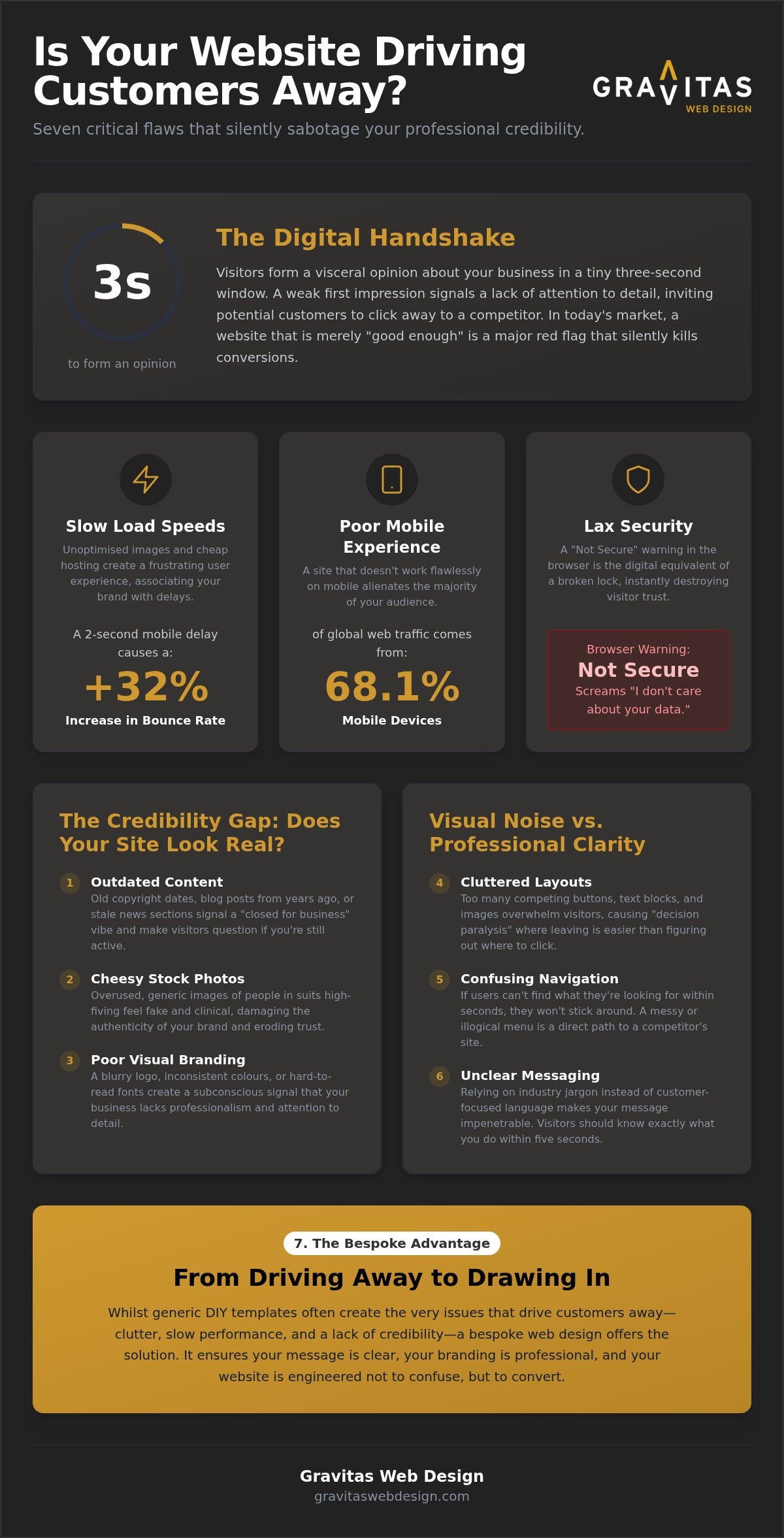
The psychology behind this is fairly brutal. Most visitors form an opinion about your brand in a tiny three-second window. If you’re currently asking “is my website driving customers away”, the answer often lies in this split-second visceral reaction. In a crowded market, having a site that is merely “fine” or “good enough” is a massive red flag. “Fine” doesn’t inspire confidence. Instead, it invites your audience to see what the next person on Google is offering. When your digital presence feels like an afterthought, you’re essentially handing your leads to the competition on a silver platter.
The Credibility Gap: Does Your Site Look “Real”?
Professional branding is the bedrock of trust, especially for firms in competitive hubs like London where the standard is sky-high. If your site relies on those cheesy, overused stock photos of people in suits high-fiving, you’re bleeding credibility. Everyone has seen those images before. They feel fake and clinical. Similarly, an outdated copyright footer or news posts from three years ago signals a “closed for business” vibe. It makes people wonder if you’re still trading or if you simply don’t care about your public image. Trust is hard to win and remarkably easy to lose with one outdated plugin or a blurry logo.
Visual Noise vs. Professional Clarity
Try the “squint test” on your homepage. If you blur your eyes, can you still tell exactly what you do within five seconds? If the answer is no, you have a visual noise problem. Cluttered layouts and competing buttons lead to “decision paralysis,” where the visitor gets overwhelmed and leaves rather than trying to navigate the mess. This is a core principle of Web usability; making things easy shouldn’t be an afterthought. This is where the “DIY look” often fails. Whilst a template might get you online, bespoke web design ensures your message is clear, professional, and designed to convert rather than confuse.
Technical Turn-Offs: Speed, Security, and Mobile Mishaps
Ever clicked a link and sat there staring at a blank white screen whilst your phone’s loading bar crawls along? We’ve all been there, and we usually don’t wait. If your site takes an age to load, you aren’t just testing a visitor’s patience; you’re actively dismissing them. Research shows that Users really care about speed, and even a two-second difference in mobile load time is associated with a 32% increase in bounce rate. When you’re left wondering “is my website driving customers away”, these invisible technical gremlins are often the chief suspects. It’s the digital equivalent of a shop with a stuck front door; eventually, the customer just walks to the shop next door.
Then there’s the dreaded “Not Secure” warning. Seeing that red padlock or a browser alert in the address bar is like finding a “Beware of the Dog” sign on a boutique entrance. It screams that your business isn’t looking after its visitors or their data. Keeping these gears turning requires more than a “set and forget” attitude. It’s why proactive WordPress maintenance services Lichfield are so vital. They act as your digital insurance, ensuring the site stays fast, the software stays updated, and the hackers stay out.
The Need for Speed in a Fast-Scrolling Age
Google doesn’t just care about what you say; it cares about how fast you say it. In competitive markets like Birmingham, your Core Web Vitals, specifically your Largest Contentful Paint (LCP), should be under 2.5 seconds to keep you in the good books. Usually, the slowdown comes from unoptimised, massive images or cheap, sluggish hosting that simply can’t handle the weight. This wait creates a genuine stress response in users, making them associate your brand with frustration rather than solutions. If your site feels heavy and slow, your prospects will find someone who respects their time.
Mobile Responsiveness: More Than Just “Fitting the Screen”
With 68.1% of global web traffic now coming from mobile devices, a site that “sort of works” on a phone is a liability. We’ve all dealt with “fat-finger” errors where buttons are too small or menus overlap, making it impossible to tap the right link. For a high-end London property firm, a mobile gallery that stutters or fails to load high-resolution images is a deal-breaker for wealthy clients browsing on the move. You need to see what your customers see across different devices to ensure the experience is seamless. If you’re ready to fix these invisible leaks, it might be time to see how we can help.
Copywriting That Confuses: Is Your Message Driving People Away?
Ever landed on a site and felt like you needed a PhD just to understand the services page? (We’ve all been there, and it’s usually quite painful.) That is the “Jargon Trap” in action. It happens when businesses try so hard to sound “professional” that they end up sounding like a dry, dusty textbook. If you’re wondering “is my website driving customers away”, look at your text. If it is full of “synergistic solutions” and “leveraging paradigms”, you’re likely boring your visitors into an early exit. People don’t buy from textbooks; they buy from people who understand their problems and speak their language.
Then there is the “Me vs. You” problem. Most websites are obsessed with themselves. They talk about their history, their office, and their awards. But here is a secret: your customer doesn’t actually care about you yet. They care about themselves. They want to be the hero of the story, and they need you to be the guide. Professional copywriting flips the script, focusing on the customer’s pains and desires rather than your own ego. It builds an authentic voice that resonates. Small errors, like a typo in a heading or a misplaced comma, act as subtle “trust leeches.” They suggest that if you can’t be bothered to check your spelling, you might not be bothered to get their project right either.
Writing for Humans, Not Just Search Engines
We all want to rank on Google, but stuffing your pages with keywords until they read like a robot wrote them is a recipe for disaster. You need a balance between SEO and natural, persuasive English. Take your “About Us” page, for instance. It shouldn’t actually be a biography. It should be a bridge that shows how your experience solves your customer’s specific hurdles. Learning how to get more enquiries from my website starts with writing for the person on the other side of the screen, not just the algorithm.
The Power of a Clear Value Proposition
Your visitors are constantly asking one question: “What is in it for me?” If they have to hunt for the answer, they’ll leave. You need a clear value proposition that hits them the moment they land. Use punchy headings to guide them through your services like a friendly tour guide. This bespoke approach to copy ensures your message stays consistent with your visual identity. It works hand-in-hand with professional logo design London to create a brand that feels cohesive, trustworthy, and ready to do business.
Conversion Killers: Navigation Nightmares and Missing CTAs
Imagine walking into a shop where the aisles are arranged by colour rather than product type. It might look “artistic”, but you’ll probably walk out without the bread you actually came for. This is exactly what happens when businesses prioritise “clever” navigation over clarity. If you find yourself asking “is my website driving customers away”, take a cold, hard look at your menu. If your services are hidden under vague titles like “Our Visionary Approach” instead of just “Services”, you’re creating a navigation nightmare. People don’t want to solve a puzzle; they want to find a solution to their problem. When a visitor feels lost, they don’t look for a map. They look for the “back” button.
The “Where do I go now?” problem is one of the most common reasons for high bounce rates. Your homepage should act like a well-lit path, leading the visitor’s eye naturally toward an enquiry form or a booking page. If your Call to Action (CTA) buttons blend into the background, they are effectively invisible. We often see sites where the main button is the same shade of grey as the footer. That isn’t subtle; it’s a conversion killer. Your buttons need to pop, providing a clear destination for the user’s journey.
Simplifying the User Journey
A gold standard in web design is the three-click rule: a user should be able to find what they need within three clicks of landing on your site. For Birmingham businesses, this means organising your services in a way that makes logical sense to a local client. Don’t make them dig through five sub-menus to find your contact details. Whilst a “Contact Us” page is essential, it shouldn’t be the only way to engage. Consider these points for a smoother journey:
- Logical Grouping: Keep related services together so visitors can browse naturally.
- Persistent Contact Info: Ensure your phone number or a quick-link button is always visible in the header.
- Multiple Entry Points: Use internal links within your service descriptions to guide people forward.
Calls to Action That Actually Get Clicked
The language you use on your buttons matters more than you might think. “Submit” sounds like a chore; “Click Here” is a bit 1998. Instead, use benefit-driven language that tells the user exactly what they’re getting. “Start My Bespoke Project” or “Get My Free Quote” feels far more inviting. Placement is also key. You need a CTA “above the fold” (the part of the page visible without scrolling) and another at the very end of the page once you’ve finished telling your story. Use contrasting colours to make these buttons stand out without looking cheap or gaudy. If you’re tired of people bouncing off your site, it’s time to fix your user journey and start converting.
From Driving Away to Drawing In: The Bespoke Advantage
If you’ve spent the last few minutes nodding along to these red flags, you’re likely facing the uncomfortable truth: your digital presence might be working against you. It is a tough pill to swallow, especially when you’ve poured your heart into the business itself. But here is the good news. Transitioning from a site that repels to one that attracts isn’t about chasing every new trend. It is about moving away from the limitations of DIY templates and embracing the power of a bespoke strategy. Whilst a template might get you online, it often lacks the soul and the structure needed to convert a sceptical visitor into a loyal client.
A strategic overhaul solves all seven red flags simultaneously. It isn’t just about making things look pretty; it is about building a foundation where speed, security, and clarity are non-negotiable. This is where your website stops being a source of anxiety and starts being a “customer magnet”. When you combine this with ongoing maintenance, you aren’t just fixing a problem; you’re taking out digital insurance. You’re ensuring that the next time you ask “is my website driving customers away”, the data gives you a resounding “no”.
Why Custom Web Design is an Investment, Not an Expense
It is easy to look at a new site as a cost, but the real expense is actually the “lost lead”. If your current site is confusing just one high-value prospect a month, the cumulative loss to your bottom line is staggering. Choosing bespoke web design Birmingham allows your digital presence to scale with your growth. You aren’t boxed in by a rigid theme or a clunky page builder. Instead, you have the peace of mind that comes with a site that “just works”, allowing you to focus on running your business rather than fighting with a broken layout.
Your Next Steps to Digital Credibility
Take a moment to browse your site as if you were a stranger who just found you on Google. Be brutally honest. Do you feel the “Digital Handshake” we mentioned earlier? Or does it feel like you’re shouting into a void? Conducting this personal audit is the first step toward reclaiming your credibility. You don’t have to navigate this transition alone, though. Every business needs a professional, straight-talking partner to cut through the jargon and provide clear, actionable solutions. If you’re ready to stop the silent exit of your potential clients, it is time to Get a refreshingly honest assessment of your website from Gravitas.
Turn Your Digital Handshake into a High-Converting Asset
Your website should be the hardest working member of your team, not a silent leak in your marketing budget. We’ve explored how technical sluggishness and confusing jargon can quietly kill your conversion rates. If you have been left wondering “is my website driving customers away”, it’s time to stop guessing and start growing. A site that actually works is one built with intention, combining bespoke designs that build instant credibility with a transparent, jargon-free process.
As local experts in Birmingham and Sutton Coldfield, we understand the pressure of standing out amongst slicker competitors. You deserve a digital presence you are proud to share, supported by a partner who talks straight and delivers results. Don’t let “good enough” be the reason your best leads walk away. It’s time to reclaim your professional pride and give your prospects a reason to stay.
Book your free website audit with Gravitas today and let’s turn those red flags into a green light for your business growth. You’ve built something great; let’s make sure your website reflects it.
Frequently Asked Questions
How can I tell if my website is actually driving customers away?
You can spot the damage in your analytics. Look for high bounce rates or a low “average time on page.” If visitors are fleeing within seconds, it’s a clear sign of trouble. If you keep asking “is my website driving customers away”, check your enquiry count. If you have traffic but zero leads, your site is likely confusing them. An outdated site will send prospects straight to your competitors in Sutton Coldfield.
Why is my bounce rate so high if my website looks okay to me?
You’ve likely got a “curse of knowledge” problem. Because you built the business, the site makes sense to you, but a stranger might find it a maze. High bounce rates usually point to “visual noise” or a slow mobile experience. If your site lacks a clear value proposition, visitors won’t stay to solve the puzzle. They’ll just find someone whose message is easier to digest and navigate.
Is a slow website really that big of a deal for a local business?
It’s a huge deal. Modern customers are notoriously impatient, even when looking for local services in Lichfield. Research shows that a two-second difference in load time can increase bounce rates by 32%. Google also uses speed as a ranking factor for local search. If your site is sluggish, you’re basically testing your customer’s patience before you’ve even had a chance to say hello or show your work.
How often should I update my website design to stay relevant?
There is no set rule, but a major refresh every three to five years keeps you ahead of the pack. However, technical maintenance should be ongoing. Think of it as “digital insurance.” If your site looks like it belongs in the early days of the internet, people might assume your business methods are just as dated. Regular updates ensure you stay secure, fast, and visually relevant to your audience.
Do I really need professional copywriting or can I write it myself?
You can write it, but you’ll probably fall into the “jargon trap.” Professional copywriting isn’t just about avoiding typos; it’s about persuasion. Most business owners talk about themselves too much. A pro knows how to make the customer the hero of the story. It’s the difference between a dry list of services and a compelling narrative that actually makes people want to pick up the phone and call.
What is the difference between a template and bespoke web design?
A template is like a “one size fits all” suit; it sort of works, but it never looks quite right. It’s often bloated with code that slows you down. Bespoke web design is a custom build tailored to your specific goals and brand identity. It’s faster, more secure, and allows you to scale without the annoying limitations of a pre-made theme. It ensures you don’t look like every other firm in Birmingham.
Can a bad website hurt my local SEO rankings in Birmingham?
Yes, it definitely can. Google watches how people behave when they visit your pages. If users click your link in Birmingham and then immediately “bounce” back to the search results, Google gets the message that your site isn’t helpful. This “is my website driving customers away” signal can lead to a steady drop in your rankings. To rank well, you need a site that provides a great experience.
How much does it cost to fix a website that isn’t converting?
The investment depends entirely on whether you need a few strategic tweaks or a full bespoke overhaul. We don’t believe in generic pricing because every business has different hurdles. Instead of seeing it as an expense, think of it as reclaiming lost revenue. Every lead that bounces off your current site has a price tag attached. Fixing those leaks is the fastest way to see a real return on your digital presence.